Interior design for jewelry brand Precita in Ho Chi Minh City is one of the prominent projects in Ho Chi Minh City. Traditionally, most jewelery markets often display luxury in modern style. But here, with the great idea of the architects have found a trendy design and luxury in the classic style.
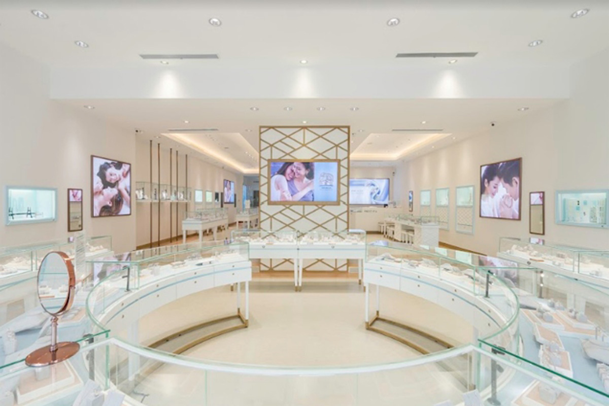
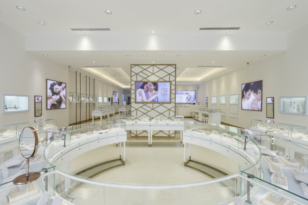
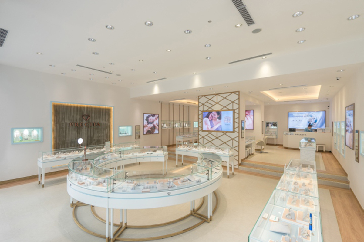
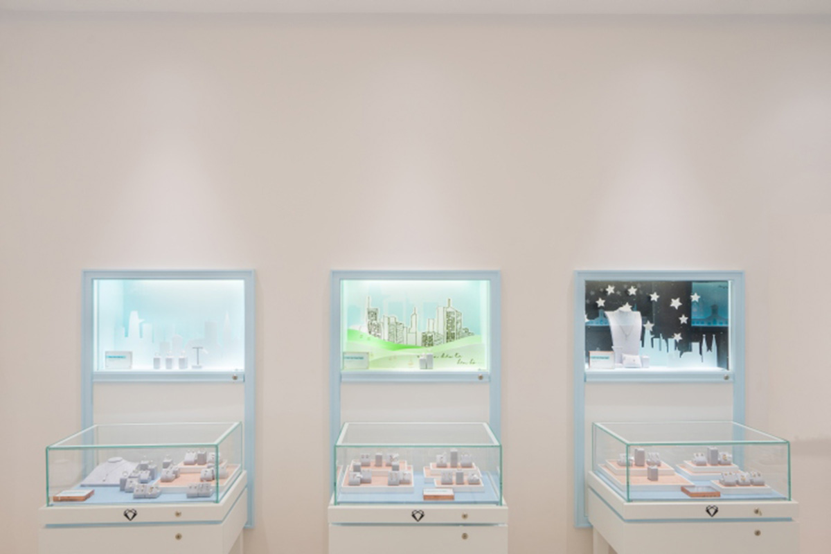
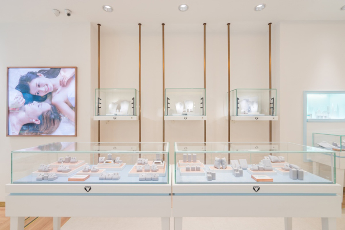
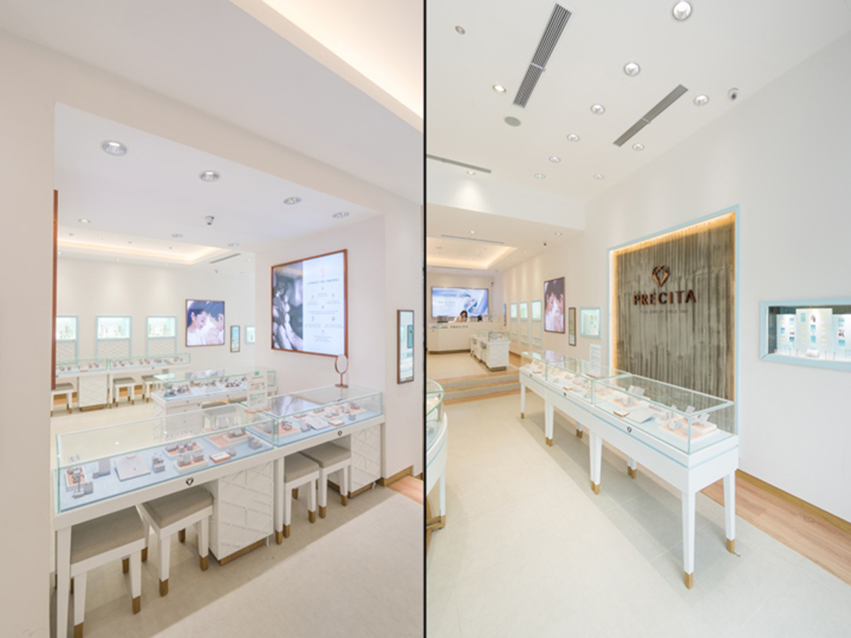
With this idea, architects seek the balance between sensitivity and courage, presenting fashionable jewelery with modern light and elegance with a classic style. Visitors are led into the shop sparkling by the jewelery cabinets with subtle light blue borders and excellent lighting.
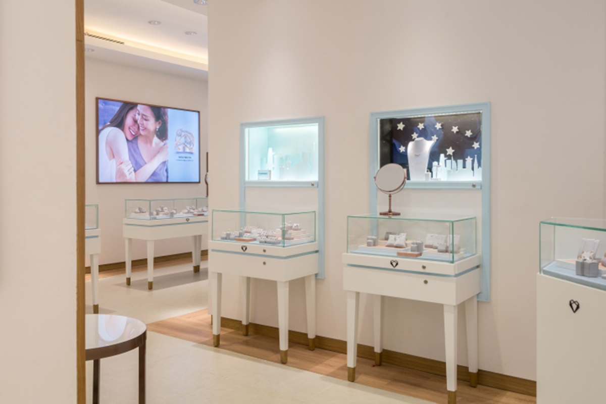
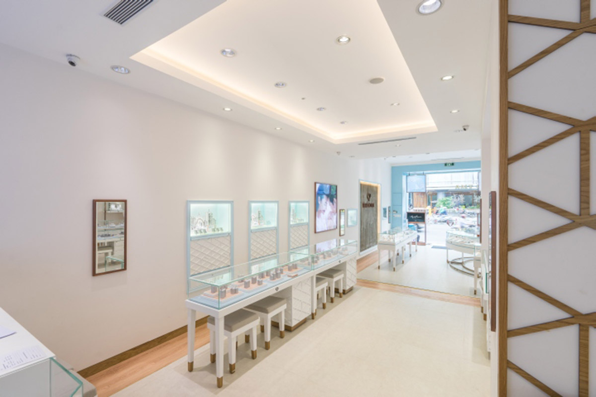
The narrow and historic structure of the Vietnamese building was dissolved by soft white mortar walls and large wall cabinets reminiscent of glass windows. It is where the contemporary feel is highlighted by a blue color - the official color of the brand.

A remarkable staircase leading to the second floor, the geometric handrails depict the word 'Precita' in oak and glass, a unique expression of the brand name created by the designer. The second floor displays higher value items.
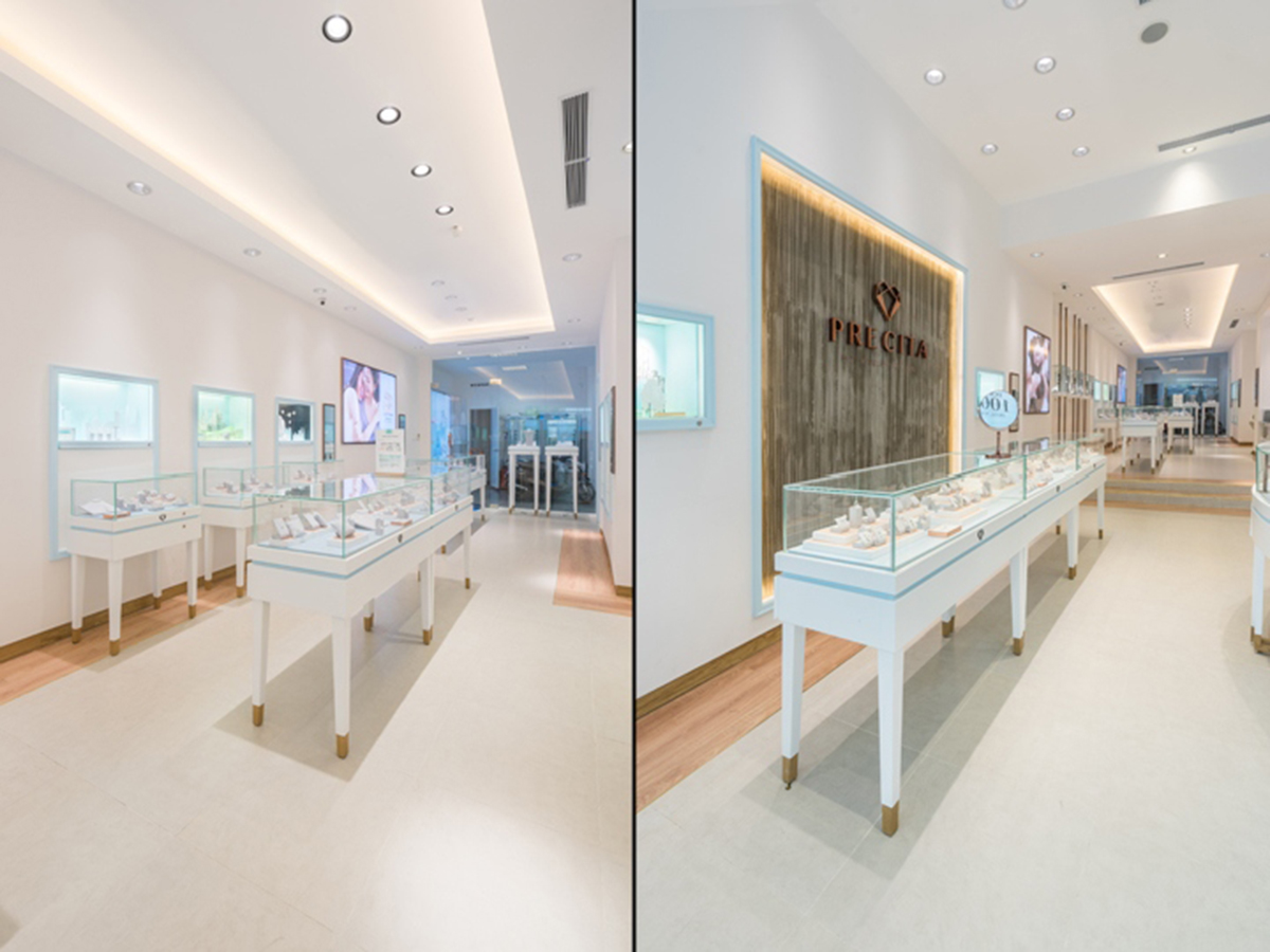
Here the transparent cabinets and mirrors are attached and are distinguished by the woods, causing them to be suspended in a gentle atmosphere that attracts curiosity. The ground floor is an open space that deliberately overlooks the entrance, leading to an open air flow in and out of a large open space.
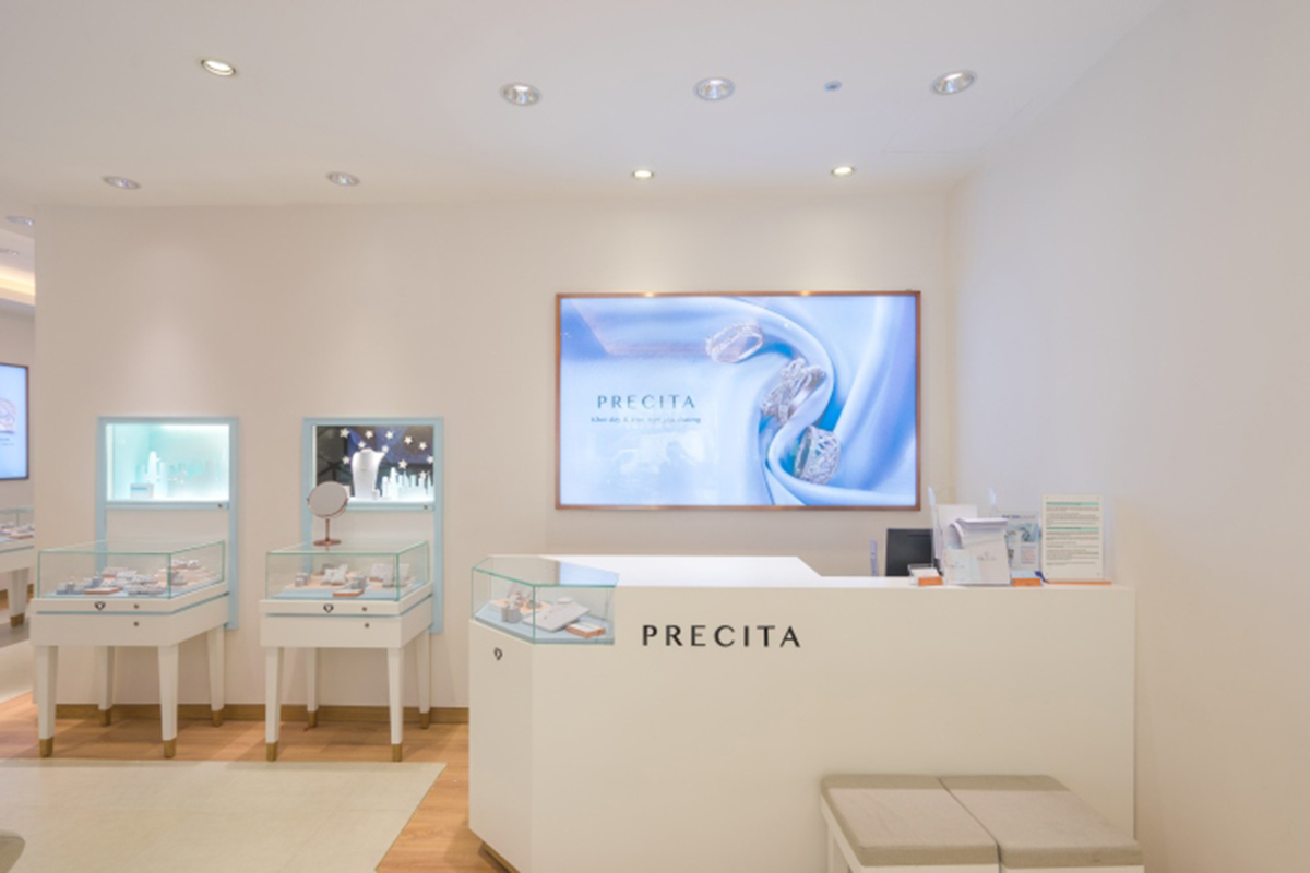
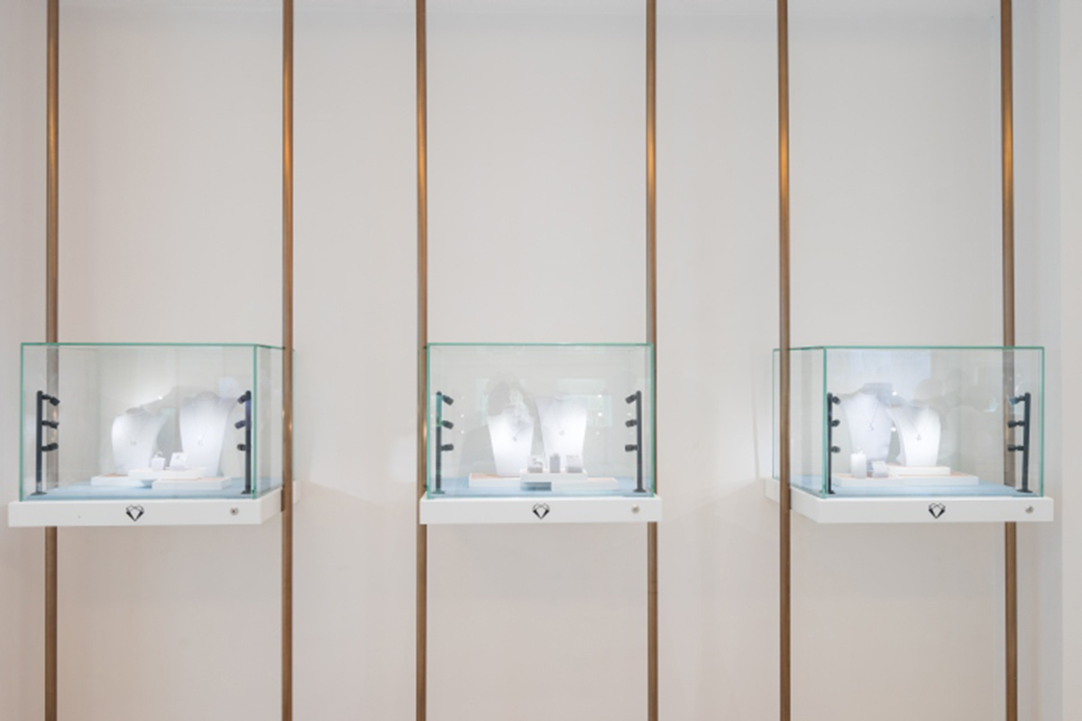
The materials have been selected to represent the characteristics of the brand. The cabinets are painted white with yellow metal rose on the glass along the brand name and color.
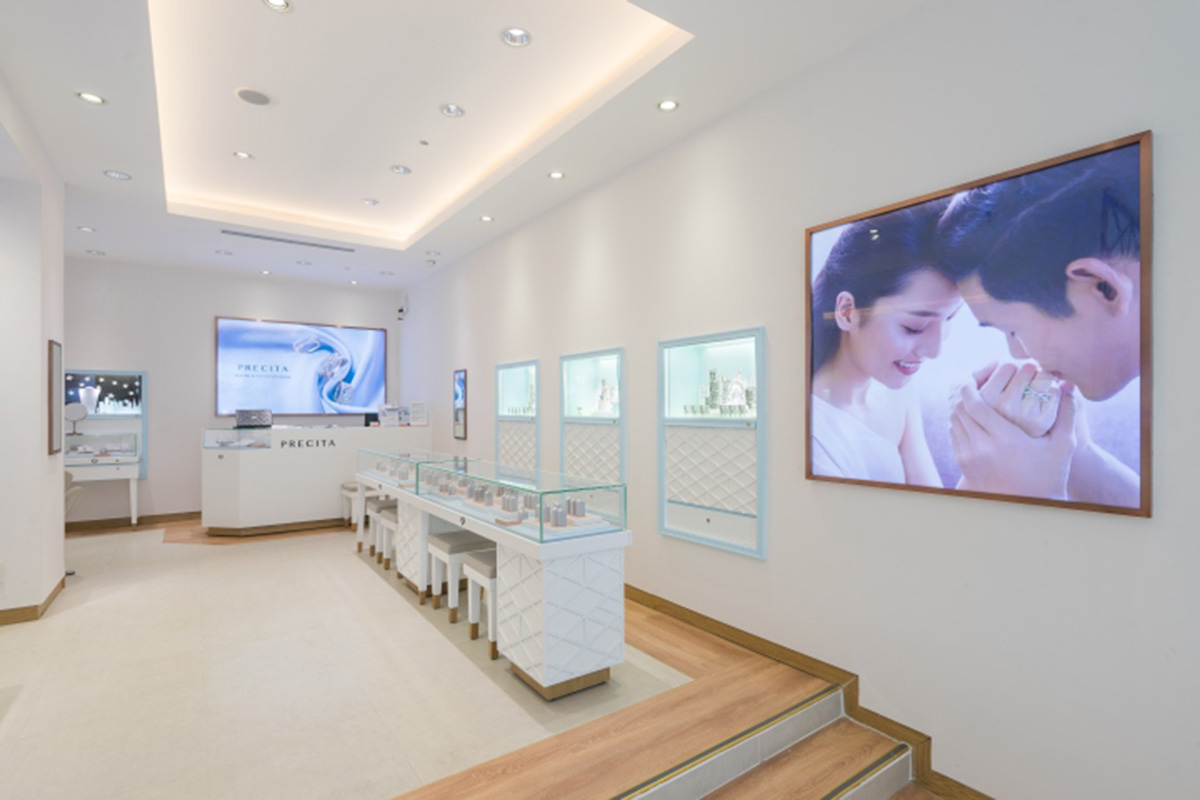
Brand frames are secured by modern concrete slabs, while clean gray wood floors are surrounded by oaks to create warmth. Wood also keeps the foot of the cabinet standing firmly on the floor, giving a light feeling and increased luxury.
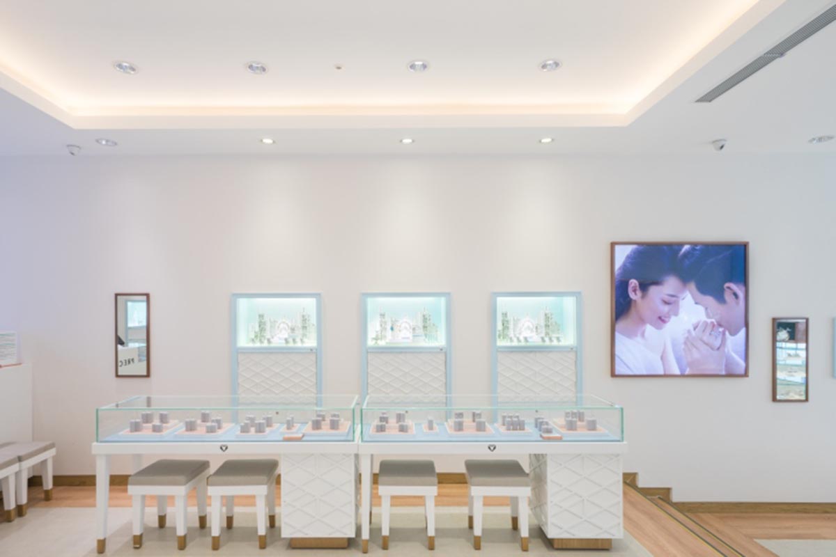
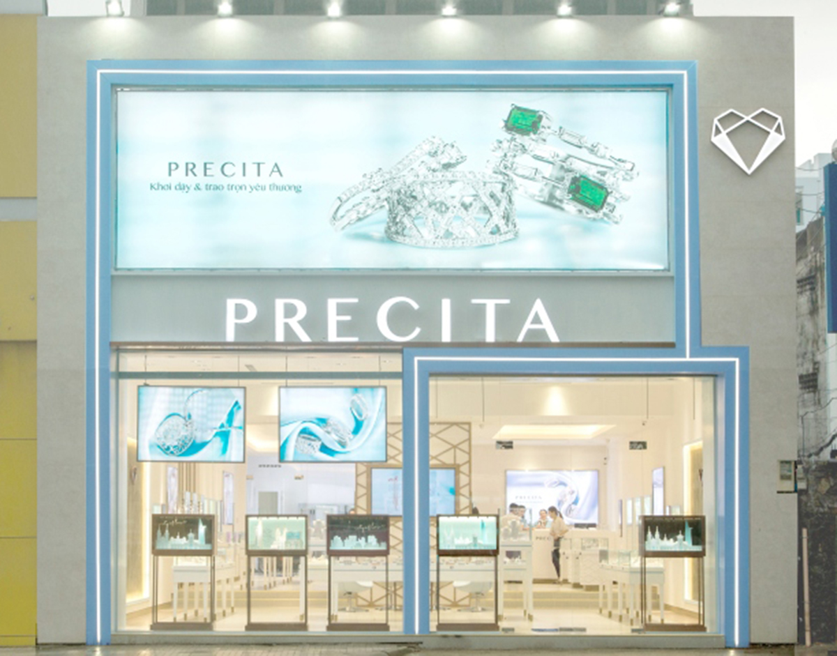
Shop lights combine for their own purposes through each function, illuminating precious objects and also forming a starry night from the outside.
The façade, inspired by the 1950s American style, stands unique and clean. It represents the determinants of the store in layers. The cool blue lines for the ash colored finish, the unique Precita pattern coming down from the top floor, The lighting fixtures are repetitive - they all combine to create a tone of graceful grace. At night LED lighting, framing and confirming the presence of a brand new, and a fresh way of thinking about jewelry.
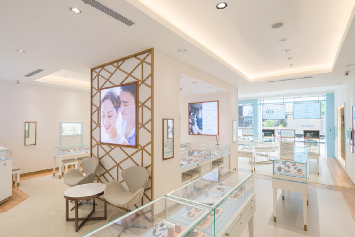

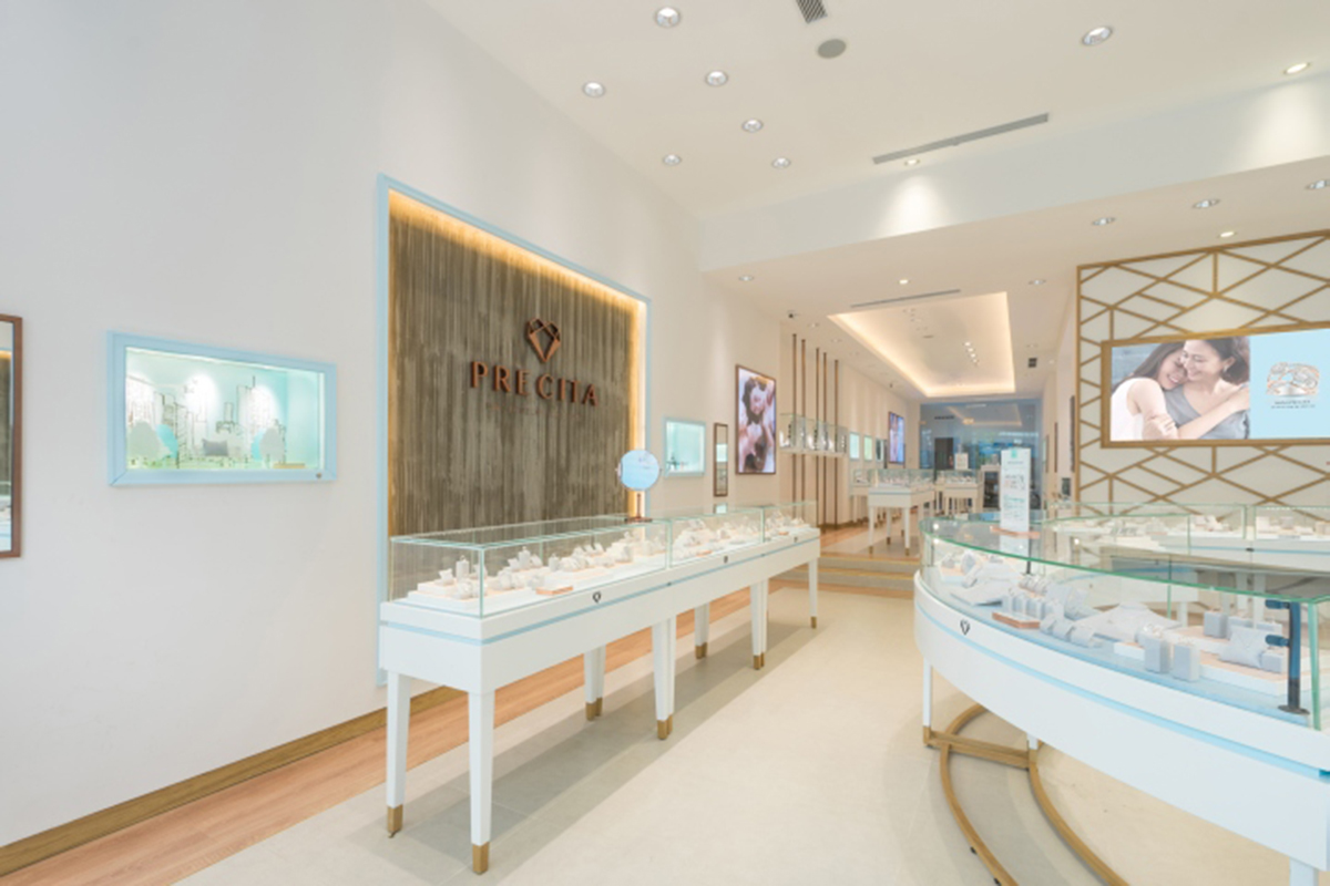

Angel Interior Design - Breakthrough Ideas - Make a level


